Update: all of this led to an actual app called Weel
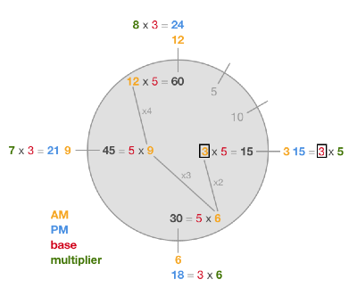
As a kid, it took me forever to get my head around reading analog time. Everything else was metric, base 10, but then suddenly there was this system in segments of 12, 60, 30, 15, and 5. What was this, base 3? Why were there fives in it?
The math of it seemed both significant and arbitrary:
All of this was a massive distraction from simply seeing what time it was.
I also have some form of numerical dyslexia/synaesthesia/dyscalculia, which is often comorbid with ADHD and probably contributed as well. I saw numbers representing themselves visually, or as characters (I gave them eyes and teeth in my notebooks).

Meanwhile when I looked at a clock, the day did not match where the hands were, visually. Everything seemed arbitrary, the mixing of fives and threes, the dividing of the day at noon, a point past where the day had already begun.
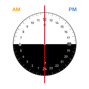
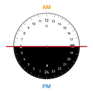
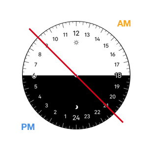
Currently we split time according to noon and midnight, probably because of sun dials, where noon is a really obvious point on the scale. But once we had mechanical clocks, we could just as well have split it between average dawn and dusk to turn it into night and day. These days what people think of day and night has shifted, and nine to nine might make more sense. More on this later. (face adapted from World Clock )
24 hour time
Later on I found out about 24 hour watches, which made a lot more sense to me. The face is like the globe seen from the top as it turns, or like a horizon as the sun rises and sets. I like the horizon model, since the oldest way of telling time is checking where the sun is in the sky. The "time hand" in a 24 hour clock represents this directly. Sun dials came later, and screwed everything up.
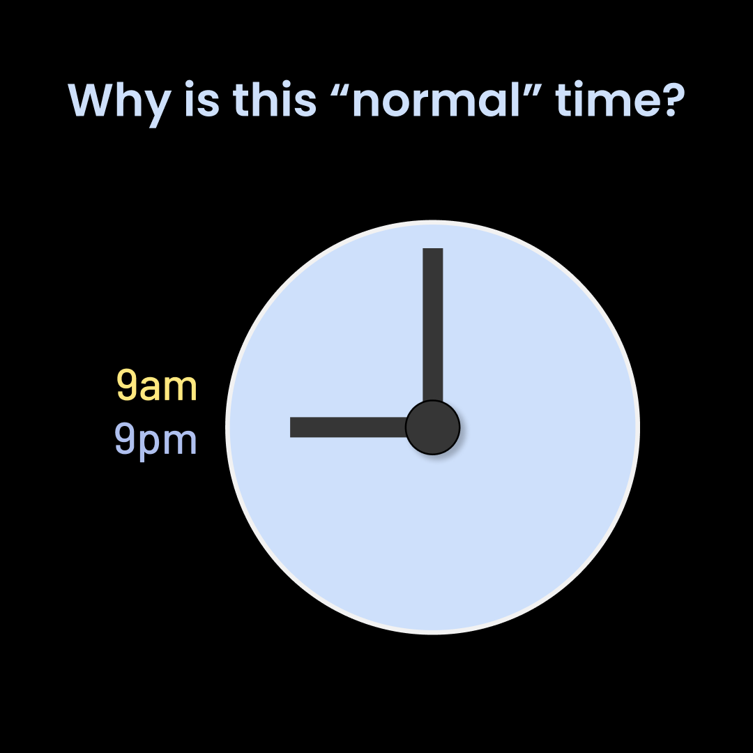
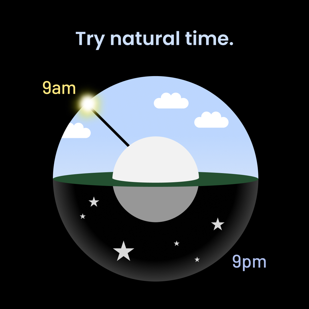
So-called normal time vs. natural time
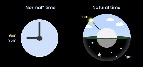
"Normal time" makes you internalize the idea that it's okay for nine in the morning and nine at night to look identical. Why must it be like this? I suspect this is one of the factors that makes time blindness in neurodiverse people (like those with ADHD) worse than it needs to be. You are forced to interpret time not only in terms of two arrows pointing in two directions on two entirely different scales, but each combined arrow shape corresponds to two different times of day. Of course you know which one is which right now based on whether it's day or night. However, in terms of remembering what time something is, it ends up more a visual representation of a number than the concept of that particular time itself.
Add dyscalculia to this and the unnecessary cognitive load is almost cruel. You look at your appointment time, then at those arrows, then translate those arrows into their numbers and which part of the day they are, while matching this to the aforementioned time and counting how much time till then. Which sounds like it should be easy (I'm jealous of how often it is so, for neurotypical people), but when it's hard to keep numbers in your head without them switching places and warping into each other to begin with, doing it every time feels like you're figuring out how many cans of paint of what size will cover a room.
Having used a 24 hour dial for some years now, I can say with confidence that I'd never switch back to the 12 hour dials. Someone said it's like getting glasses or a hearing aid for the first time, and that sounds about right.
Time zones and events
Switching to a 24 hour dial also opens up new possibilities. For example, you can follow multiple timezones at once. I messed around with this idea as a physical international project clock where the face turns, showing time of day as light or dark, and the hands of the clock, representing time zones, are drawn as needed on the plexiglass cover:
The lovely iOS "World Clock" app does an even nicer job of this (it's incredibly annoying that Apple doesn't allow custom watchfaces on the AppleWatch).
24 hour clocks in digital form also introduce the possibility of showing a day's appointments around the watchface. For some reason, however, no smartwatch I currently know of gives developers this kind of access to the user's calendar data.
Samsung Galaxy Watch has a My Day watchface, but it's 12 hours and locked-down native to the system, so no mods (or time zones) possible:
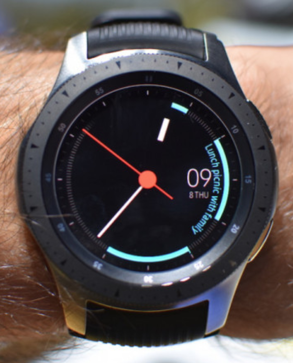
This seems a strange oversight. When we look at our watches, we're inevitably comparing the current time to a memory of the time of our next appointment, and making an estimate of the difference between them. Why not show both in the same space? Or indicate time left till the next appointment in an analogue way? (pop-up notifications for this are the current solution) Why is this still so rare?
Yes, you can buy a 24h analog wristwatch
Here are my favorites:

BOTTA design
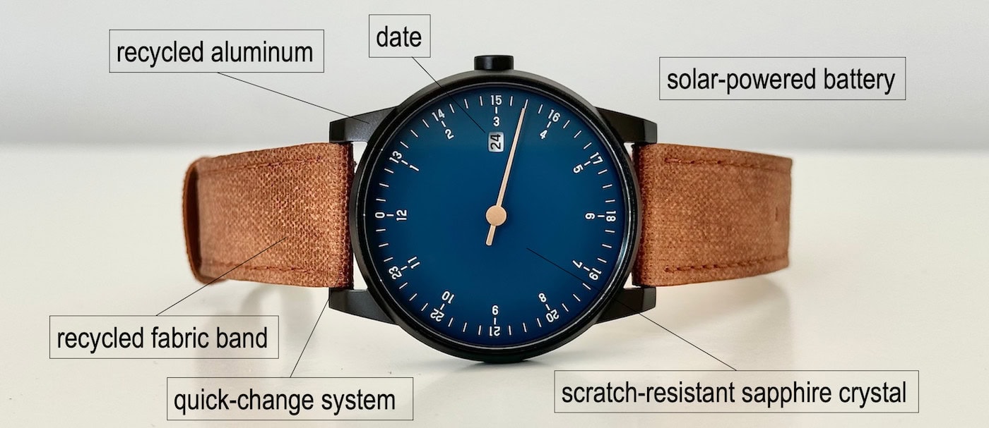
slow watches
More rabbit holes to go down:

Watchface options in smartwatches
When the Apple Watch came out, I expected the company of Think Different to have at least one watchface that reinvented time (instead of, say, another Disney character tie-in.). Screens offer so many interesting possibilities!
A common criticism of opening up your watch OS to allow custom watchfaces is that you end up with a vast sea of crap. I suspect this is due to a few factors:
- Tools to make watchfaces are limited by how hardware companies think about time, and therefore by what access they provide to what.
- Some manufacturers are stuck on the idea that a digital watchface should look like a copy of a physical watchface. This introduces obvious limitations, and the end result rarely looks good; screens with enough detail to make this sort of skeuomorphism look decent also eat so much battery life if they're left always-on that they're usually left off anyway. What's the fashion utility of a Rolex-like face which is a dark disc most of the time?
- Many devs have no sense of design and most tools to create watchfaces are too technical for most designers.
Possible solutions:
- Give watchface makers access to all the data you can. You don't know what they might use it for. Allow for things like 24 hour rotation.
- Provide examples of company-made watchfaces that show an alternative view that take advantage of the mutable nature of screens, in additional to more traditional fare. Hire digital designers, infodesigners, and digital artists, not just watch designers.
- Provide designer-friendly watchface-making tools (Samsung is doing well on this front)
With so much to play with, I think this is a really fertile area to push the envelope and see what happens.
Parent bonus: The noon-to-midnight conceit
Trying to explain time to my children has brought up new perspectives. Why have we split the day noon to midnight? It makes astronomical sense, but does it make human sense?
It must be to split daytime from nighttime, they said.
But the day does not begin at noon, and the night does not begin at midnight. For a child whose day begins at school at 9 and goes to bed at 21, this might make more sense:
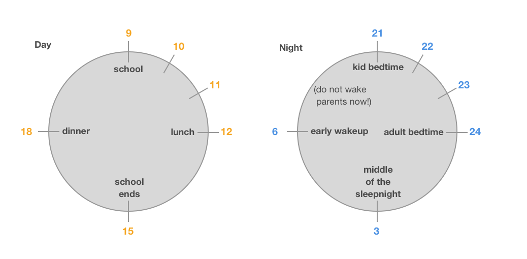
I've also noticed that one factor kids can stumble over when learning to read analog time is that a clock is really two clocks on top of each other. Introducing the hour clock and the minute clock, and THEN the combined clock may be a helpful approach:

BONUS for clock geeks: the Japanese had an entirely different way of dividing time, where the hours of the day were longer or shorter depending on what season you were in, and there were some gorgeous mechanical clocks developed around that system: https://deployant.com/masahiro-kikuno-and-his-wadokei-temporal-hour/
Originally published November 2017, updated May 2025
